
Every month, more than 197 million people around the world visit Amazon.com. In fact, 25% of the world’s population are considered “digital buyers”. That’s nearly 2 billion people looking for an easier shopping experience, one that beats out physical stores and makes the purchasing process seamless. The growth potential for online stores is immense. Given the statistics, you’d be surprised at how many eCommerce sites still have a long way to go in effectively implementing user experience design to create a high quality eCommerce store that converts.
Building an effective eCommerce business first requires an understanding of the two categories of eCommerce sites; single product and catalog sites. Both sites have vastly different philosophies.
Single Product eCommerce Site: Take your user on a journey
A simple site is just what you need. A single product eCommerce site’s goal is to lead the user down a detailed, targeted path. Dollar Shave Club is an excellent single product, subscription based, eCommerce site example. The copy, imagery and interaction design is built around selling one product (with a few upsells along the way). You thought you just wanted a razor, who knew you also needed shaving cream, maybe some soap and a neat little traveling kit?
Created for a specific customer demographic, a single product eCommerce site’s main goal is achieving a high conversion rate. Effective sites dedicate the premium content areas to catching and holding the attention of a targeted demographic immediately. Dollar Shave Club’s website design is intuitively created. The first visual element a user encounters is the dynamic hero video with men of all ages utilizing their products. Catchy, eye popping, and explanatory; a picture, or video, is truly worth a thousand words. With such a specific, targeted demographic, a complete understanding of the user journey, though important for all websites, is arguable most important within an eCommerce site.
Often times, a site for products launched via Shark Tank, Kickstarter or other infomercial-like products, are great examples of a product selling its story. Aligning with potential customers and encouraging them to make an investment in your product is your goal. Never give the user a reason to second guess their purchase.
Catalog eCommerce Site: Graceful interactions and visually pleasing design
On the other hand, catalog commerce websites have an entirely different philosophy. The obvious example of an effective catalog site is Amazon. Typically geared towards more than one demographic, an effective catalog site is comprised of a several different component blocks, but still easy to navigate. Like Amazon, the homepage contains a series of lists, best-of’s, sorted product and category pages. Catalog sites often require a user account and don’t allow anonymous purchasing. The site must generate orders and invoices and accommodate several different demographics while presenting each interaction in a way that is graceful and visually pleasing.
User friendly UX and interaction design is at the heart of creating an ecommerce site that converts. Effective catalog sites are geared to quickly allowing users visibility into all available products. Examples of catalog sites include:
- Digital product sites such as those selling ebooks and music.
- Sites that curate and drop-ship products (Oberlo, Spocket).
- Sites selling concert tickets (Ticketmaster). They not only track purchases but also act as a record of reservation.
Ecommerce sites can have highly varied degrees of intelligence. At a minimum, designers and developers should ensure that each product page contains high quality imagery, a thorough description and an opportunity for a purchaser to leave reviews.
How do I increase conversions on my eCommerce website?
There are numerous eCommerce sites floating around on the world wide web, yet many miss the mark in one way or another. Here are 3 key tips to beating out the competition and building an online store that converts.
- A Powerful Search Engine An eCommerce store is just that, a store. Shoppers arrive with a mission in mind. It is to your advantage to make the search process as simple as possible. Are there any specials, deals-of-the-day, new products? Items specifically designed for women or men? An eCommerce site search engine and filter capabilities should be advanced. Ensure that users can easily access products catered to them.
- A Checkout Flow Customers Can Follow Let’s say that your exceptionally designed, user friendly, eCommerce site successfully convinced a user to place a few items in their shopping cart. Don’t let them abandon your site. Remind your eCommerce web designer to make the checkout process as simple as possible. A cohesive checkout should contain no more than 1-2 steps.
Remember, users are making purchases from both web and mobile devices. Magento, well known for empowering thousands of retailers and brands as the world’s most powerful eCommerce platform, designed a unique solution. They knew that things can be creatively made to appear shorter by implementing a multistep process on a single page. Rather than sending the user on a confusing path during the checkout process, its interface utilizes a set of mini-steps on a single page. Check out and example below.
A simple buying process utilizes a proper visual hierarchy and provides the user with clarity and control.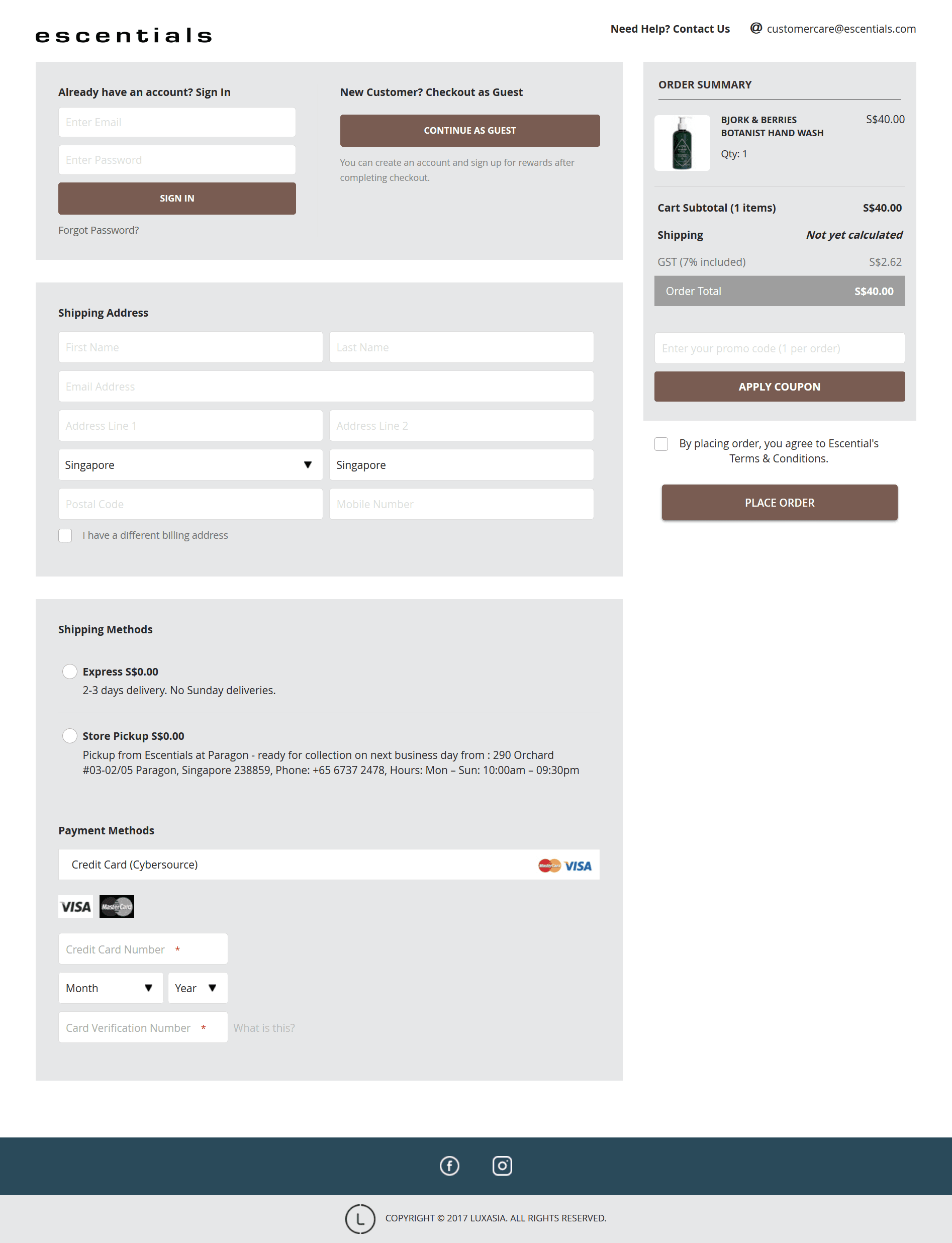
- A Proper Thank You Lastly, don’t make the design flaw that plagues an innumerable number of eCommerce sites.Users that have completed the checkout process should never be “dumped” back at the homepage of your site. This happens far more often than you’d expect. In fact, when an UX designer successfully offers a user a proper post purchase “thank you”, it’s the exception, not the rule. Ensure that your users exit gracefully. Provide them with helpful links, show them you appreciate and value their business.
- Bonus: Speed Is Your Friend Here’s the brutal reality: loading time affects your bottom line. The longer a user has to wait, the more likely they are to abandon the page. In fact, a user is 40% more likely to abandon a page if it takes longer than 3 seconds to load. Conversion rates drop drastically for slower sites. Shockingly enough, nearly half of online shoppers will tell their friends about a poor shopping experience. Here’s the deal; be careful before you sacrifice site speed for the latest aesthetic design or shiny new functionality.
Key Takeaways
Whether you’re building a single product or catalog commerce site, implementing a strategic approach to eCommerce web design will benefit your product in the long run. A fast website that leverages a powerful search engine, a simple checkout process, and a graceful exit is your ticket to building an online store that converts.
—
Our team is proud to be recognized as one of the Top eCommerce App Development Companies on DesignRush.
Contact us to kickstart your next eCommerce project!