
Wireframing, sometimes referred to as UI design or user experience design, is a critical part of the overall design process. App and website wireframes can range from being as simple as a hand-drawn sketch with pen and paper to being as complex as a detailed blueprint.
Wireframes are usually the first tangible thing our clients (and developers) see which visually represent the product or idea. Most people I’ve worked with on projects historically tend to view wireframes as a design document, but I’ve always thought of them as a technical document. Why is this? Because even though the wireframes are a visual expression of the site, they tend to become the foundation for everything that follows.
Here’s an example: Developers often use wireframes to estimate effort for the technical implementation.
For this reason, it generally pays to spend some time adding more detail to your low fidelity wireframes. The idea is to use more real (vs placeholder) content. If you’re building a product page, why not use a real product image and some real product copy? Trust me, you’ll be doing yourself a favor.
Here are 5 tips for getting started with wireframing on your own project:
- The more realistic, the better (within reason) I mentioned this above, but I really can’t stress it enough: the more realistic your wireframes look, the better. It’s all in the details (as usual).
- If you’re using a columnized layout template (like Bootstrap), consider incorporating it during wireframing. If developers end up building off of wireframes, this will help them align consistently and produce meaningful work.
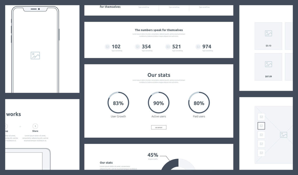
- Using grey boxes marked “image” gets a point across, but it might not be the one you want to convey. Try using real images that fit the general purpose and subject matter of the page. If you want to make it clear these are not production-grade assets, simply desaturate the images (or tint them with the color theme in the wireframes).
- Lorem Ipsum text generators were all the rage for a while – but I never use them. We believe firmly that anyone looking at the wireframes will fundamentally understand less about the purpose of the page and elements if generic text is used. If the content exists, I recommend taking a little extra time to try to use it – trust me, you’ll start gathering feedback that is more useful, and usually more directed (since they won’t be reacting to lack of content and imagery).
- Using simple flows to demonstrate transitions, or cause and effect Showing off a series of individual wireframes for pages of your website illustrates how those particular screens look, but there’s a lot they don’t show. Take a sign-in screen, for example. What if the user types something incorrect before signing in? What if the submit button is supposed to be greyed out until the required fields are filled?
Using modern wireframe tools like Sketch and Invision, it’s now much easier to quickly produce derivative screens that show state transitions.
With the example above, I would likely build the following screens: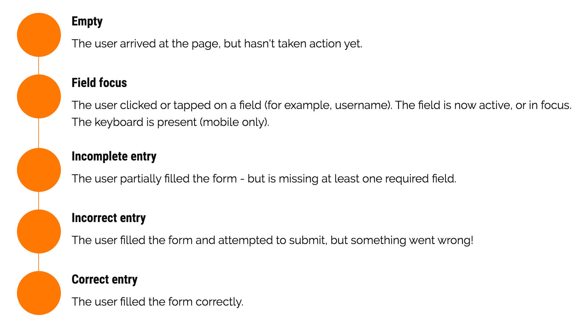 Creating these extra screens only takes me a few extra minutes – but it saves me a good deal of typing and annotation attempting to explain this to project stakeholders. And ultimately, we think our clients prefer this method of digesting information, vs reading length descriptions and specifications.
 - Including contextual page and component-level states I touched on this briefly in #2 above, but it’ll pay off in the long run to produce screens that show specific response states (based on user input). I suggest you consider including visual representations of these states – this can be done generically, or within each specific flow.
Response states
- Success
- Warning / Alert
- Error
- Failed
- Pending / In Progress
Input States (buttons, etc)
- Default
- Hover
- Focus
- Press (click)
- Staying organized is worth the cost Whichever app you use to create your wireframes (we use Sketch), it’s important to stay diligent and invest the time to keep things clean, organized, and consistent. Chances are excellent that when you transition into creating the polished visual design, you’ll appreciate having a clean set of wireframes to start with. Or you can spend the first 5-10 hours cleaning everything up – it’s your choice.
- Maintain a consistent source of truth If you’re a freelancer or the only person who will be working on these designs, then you will realistically have much less of a need to keep track of your design files. Why is this? Because you’ll probably only have a few – and you’ll be the only one updating them. But if you’re on a team, how do you maintain all these contributions cleanly within a single source of truth?
You could use Dropbox to maintain multiple Sketch files, where each team member duplicates the “master” file (source of truth), makes the changes for a specific feature, then saves that file with a date and version tagged in the filename. This is a major pain in the ass. Pretty much everything about it is inconvenient and time consuming.
Why put up with any of that when you can just use a service like Abstract?
I come from an administration and development background, so the idea of tracking design changes with a real versioning system is exciting to me. As long as it’s used right, it pretty much guarantees you’ll never lose, replace, or delete anything by accident.
Abstract isn’t the only choice for tracking designs, but it’s the only one I’ve found that works well consistently, while also keeping the front-end experience simple and easy to understand for less technical folks.
Note: We get nothing from Abstract by promoting them. We use, pay for, and enjoy the service they provide.